

Key Takeaways
- A print that looks different from your screen is normal physics, not a broken printer: screens create color with light, while paper creates it by absorbing light.
- The single most common cause is a monitor set too bright, which makes every print look dark and flat by comparison.
- Some vivid screen colors, like glowing blues and neon greens, simply cannot be made with ink, so a little shift is unavoidable.
- Letting your app and your printer both manage color at once double-corrects the image and ruins it, so always pick just one.
- With a dimmed, calibrated monitor and the correct paper setting, you can get very close, though never a pixel-perfect match.
You edit a photo until it looks perfect, hit print, and the page that slides out looks darker, flatter, and slightly off in color. It is one of the most common questions I get, and the good news is that your printer is almost never broken. Screens and paper build color in completely different ways, so some difference is baked in from the start. In this guide you will learn why prints don’t match the screen, which causes you can actually fix, and how to get the two much closer in about 15 minutes.
Screens and Paper Make Color in Opposite Ways
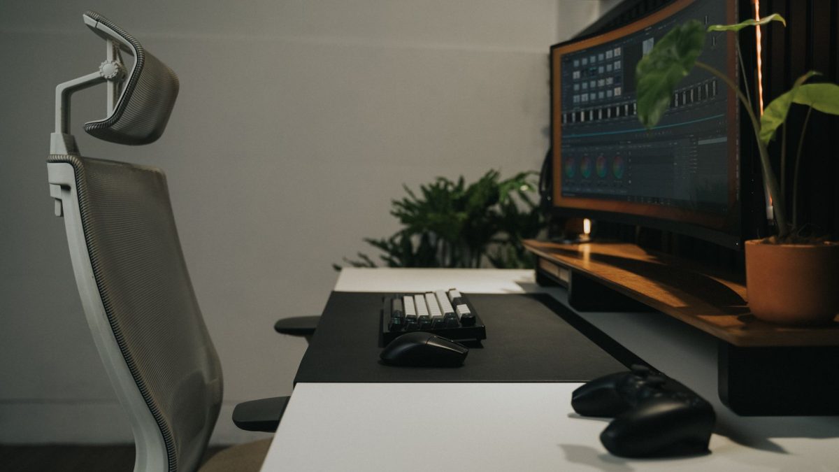
To understand the gap, it helps to know that a monitor and a printed page are opposites. A screen is a grid of tiny lights that mix red, green, and blue to build every shade you see. This is called additive color, because you start with black and add light to reach white. The result glows, which is why a bright blue on screen can look almost electric.
Paper works the other way. It has no light of its own, so it can only reflect the light already in the room. Ink and toner make color by absorbing, or subtracting, parts of that light, which is why print uses cyan, magenta, yellow, and black. You start with a white page and add ink to reach black. Because the page only reflects light instead of emitting it, the deepest, brightest tones on your screen have nowhere near the same punch once they land on paper.
Each device can also only reproduce a limited range of colors, known as its gamut. Your monitor and your printer have different gamuts that overlap but never match perfectly. Any color your screen can show that sits outside the printer’s range has to be swapped for the closest ink can manage, and that swap is one big reason a print looks slightly off. You can read more about how devices try to keep color consistent in this overview of color management.
The Real Reasons Your Print Looks Off
Physics explains part of the gap, but most of the difference people complain about comes from a handful of fixable settings. Here are the five I check every time, roughly in the order they cause trouble.
1. Your Monitor Is Too Bright
This is the top cause by a wide margin. Most screens ship cranked near full brightness so they look punchy in a showroom. At that level, shadows glow and the whole image looks lighter than it really is, so a faithful print seems dark and dull next to it. Turning your monitor brightness down to somewhere around 40 to 50 percent is the fastest single change you can make, and it often solves most of the complaint on its own.
2. The Color Cannot Physically Be Printed
Some colors live only on a screen. A saturated sky blue or a glowing sunset orange can sit well outside what four ink colors can mix. When a color falls outside the printer’s gamut, the software picks the nearest printable shade, which reads as slightly muted. There is no setting that fixes this, only realistic expectations, though soft proofing (covered below) lets you preview it before you waste paper.
3. Color Management Is Off, or Doubled Up
Color management is the translator between your screen and your printer, and it works through profiles called ICC profiles that describe how each device handles color. The classic mistake is letting two translators talk at once: the app applies its correction, then the printer driver applies its own on top, and the image gets shifted twice. Pick one manager, either the application or the printer, and set the other to none. A quick primer on ICC profiles is worth a look if you want the detail.
4. The Paper Type Setting Is Wrong
Your printer changes how much ink it lays down and which profile it uses based on the paper type you choose in the driver. Tell it plain paper when you loaded glossy photo stock, and colors go thin and washed out. Glossy and matte papers also reflect light differently, so the same file genuinely looks different on each. Set the paper type to match what is actually in the tray, every time.
5. Your Monitor Has Never Been Calibrated
Two screens side by side rarely show the same photo the same way. If yours leans blue or runs warm, you are editing against a target that was never accurate, so the print reveals the truth your monitor was hiding. A basic calibration, either with your operating system’s built-in tool or an inexpensive hardware sensor, brings the screen back to a neutral reference and makes everything downstream more predictable.
Match the Symptom to the Fix
When a print comes back wrong, what you see on the page usually points straight at the cause. Use this quick reference to jump to the most likely fix first.
| What You See | Likely Cause | First Fix | Time |
|---|---|---|---|
| Print looks dark and flat vs screen | Monitor brightness too high | Lower screen brightness to 40-50 percent | Under a minute |
| Bright blues and greens look muted | Color is outside printer gamut | Soft proof first, accept some shift | 2-5 minutes |
| Colors shifted or oddly oversaturated | Double color management | Let only app or printer manage color | 2-3 minutes |
| Whole page pale and washed out | Wrong paper type selected | Match paper type to the tray | Under a minute |
| Every print leans warm or cool | Uncalibrated monitor | Run a display calibration | 10-20 minutes |
Tip: Before you print a photo, use soft proofing if your editor offers it. Soft proofing simulates on screen how the image will look on a specific paper, dull colors and all, so you can lighten shadows or boost a flat area before you commit ink to paper. It will not make out-of-gamut colors printable, but it removes most of the surprise.
How to Close the Gap, Step by Step
Here is the exact order I work through when a print does not match the screen. Change one thing, reprint the same photo, and stop as soon as it looks close, so you never over-correct.
- Turn your monitor brightness down to roughly 40 to 50 percent and look at the image again. It may already sit closer to what you printed.
- Set the paper type in your printer driver to match the exact stock in the tray, plain, matte, or glossy.
- Find the color management setting. In your app, choose either “let the application manage color” or “let the printer manage color,” then set the other side to off. Never enable both.
- If your editor supports it, turn on soft proofing for your paper and adjust brightness and shadows until the preview looks right.
- Print one photo, not a batch, and compare it to the dimmed screen in normal room light, not under a harsh lamp.
- If colors still lean warm or cool across the whole page, run a display calibration and repeat step 5.
- Once a test print looks close, save those driver settings as a profile if your printer allows it, so you can return to them later.
I ran into this myself printing family photos on a glossy pack last year. On screen the shots were bright and clean, but every print came back muddy and dim. It turned out my laptop was pinned at 100 percent brightness and the driver still thought plain paper was loaded. Two changes, brightness down to 45 percent and the paper type switched to glossy, and the next print was close enough that nobody noticed a difference. No new ink, no service call, about five minutes of work.
Warning: Do not chase a perfect match by cranking saturation and contrast in your editor until the print looks right. That distorts the actual file, so the image will look wrong everywhere else you use it, on other screens, in email, or online. Fix the print path (brightness, paper, color management) instead of damaging the photo to compensate.
What a Good Match Realistically Looks Like
It helps to set the right goal. A print will never glow the way a backlit screen does, because paper cannot emit light, only reflect it. What you are aiming for is a print that feels like the same photo: correct in overall brightness, natural in skin tones, and faithful in the colors that ink can reach.
Judge your prints in the light they will actually live in. A photo viewed under warm evening lamps looks different from the same photo under daylight by a window. Professionals use neutral daylight-balanced lighting for exactly this reason, and even a cheap daylight bulb near your desk makes comparing screen and print far more honest.
If your colors are not just muted but actually wrong, a missing tint or a strong cast, that points to a different problem. Our guide on how to fix wrong or missing colors covers clogged channels and empty cartridges, and our walkthrough of print settings that ruin photos digs into the driver choices that quietly wreck an image. For the full map of every quality issue and how they connect, start with our complete guide to fixing print quality problems, then browse the rest of our print quality troubleshooting articles.
You can read how we test our advice and who stands behind it on our editorial policy page.
Frequently Asked Questions
Why are my prints so much darker than my screen?
Nine times out of ten your monitor is simply too bright. Screens ship near maximum brightness, which makes shadows glow and the image look lighter than it is, so an accurate print seems dark. Lower your monitor to about 40 to 50 percent brightness, compare again, and the gap usually shrinks dramatically.
Can I ever get a print to match my screen exactly?
Not exactly, and that is normal. A screen emits light while paper only reflects it, so the two can never look identical. With a dimmed, calibrated monitor, correct paper settings, and single color management, you can get very close, which is all most people actually need for photos and documents.
What is color management and why does it matter?
Color management is the system that translates color between your screen and printer using profiles that describe each device. When it is set up correctly, a red stays a believable red across both. The common failure is two translators running at once, the app and the driver, which shifts color twice and produces odd results.
Do I need to calibrate my monitor to fix this?
Not always. Start free: lower brightness, fix the paper type, and sort out color management. If prints still lean warm or cool across the board after that, your screen is likely off, and a calibration with your operating system tool or a hardware sensor gives you an accurate reference to edit against.
Why do bright blues and greens print duller than on screen?
Those vivid colors often sit outside your printer’s gamut, meaning no mix of ink can reproduce them. The software substitutes the closest printable shade, which looks muted. No setting fixes this, but soft proofing lets you preview the shift first so you can adjust the photo before printing instead of wasting paper.
Getting Screen and Print on the Same Page
A print that does not match your screen feels like a defect, but it is really just two very different ways of making color meeting in the middle. Dim your monitor, match the paper, let only one thing manage color, and judge the result in honest light. Do that, and most of the gap disappears in a few minutes with the ink you already have.
When the next quality question comes up, from faded pages to streaks to color casts, PrinterDojo has a calm, plain-spoken walkthrough waiting. Bookmark the print quality guide and come back any time your pages stop looking the way you expect.


